Cap? We’re not talking about whether or not you put the cap on your toothpaste (which I always do). Instead, we’re continuing our March Typography series here at The Branding Spot.
I recently ran into this fun, sort of spastically creative chick on YouTube talking about the Fundamentals of Typography. Not only does Karen Kavett embrace her geeky uniqueness, she manages to outline many key typography definitions in less than 3 minutes. Fun!
So, to piggyback on Karen’s quick vid on typography basics, I wanted to add a bit about CAPS. It seems I get a lot of questions about capital letters, like: When do/can/should I use all caps? When do/can/should I use mixed caps?
Mixed Caps
Mixing Lowercase And Caps In The Same Sentence (Like I Am Doing Now) Should Be Used Only For Titles, Not For Regular Sentences. As You Can See In This Example, It Takes Longer To Read And Is Far Less Legible. (Not To Mention Way Harder To Type!) We Are Not Accustomed To Reading Long Bouts Of Text Like This. Every Sentence Looks Like It Could Be Starting Or Ending At Any Time.
Ok, I’ll stop now – I think you get the picture! Some fonts mix upper and lower case letters in the middle of words such as Sumer, LLC’s package logos below. While mixed caps can make a chore out of reading body text, for a logo, mixed caps can offer a creative, playful look – different enough that it’s also unique and instantly recognizable.
ALL CAPS
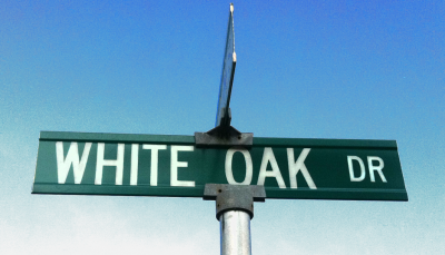
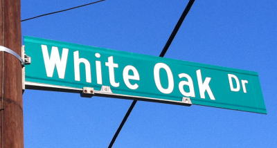
Here are two photos of road signs (same street name) in my area:
Which one do you think is easier to read?
Before you answer that question, let’s examine how our eyes and brains work when we’re reading.
Take a look at these two boxes. Can you tell me which one says the word Dog?
Probably not. How about now? Can you tell which of the following boxes says the word Dog?
If you guessed the second one, you’re right.
Why is that? Well, our brains don’t read word for word. Our brains are so super cool that when we read, we recognize words by their shapes! SO, WHEN YOU SET YOUR WORDS IN ALL CAPS, IT’S THE LEAST LEGIBLE OPTION, NO MATTER WHICH TYPEFACE YOU USE. (Plus, you look really rude in the realm of social media.) MOST PEOPLE THINK THAT BECAUSE ALL CAPS LOOKS BIGGER, OTHERS ARE MORE LIKELY TO READ IT. BUT ACTUALLY, MOST PEOPLE WILL IGNORE LONG BOUTS OF ALL CAPS IN PARAGRAPHS, because it’s actually much more difficult to read. Why? Because we have to read letter-to-letter and word-to-word, because the words lose their recognizable shapes.
Now let’s go back to our street sign example.
Some neighborhoods have a theme for their street names. This neighborhood has a tree theme. So, let’s say you’re looking for Angel Oak Dr. If the sign were in all caps, you’d have to get really close to the street sign to differentiate Angel Oak Dr from White Oak Dr.
But, when the signs are in mixed caps, it’s easier to see their shapes from farther away. So White Oak Dr is distinguishable from Angel Oak Dr before you’re close enough to be able to read the actual words.
This is exactly why the DOT is translating the old all caps signs into mixed type: because they, too, made the assumption that all caps is easier to read, but now they finally understand the importance of typography.
To Cap or Not To Cap?
Using all caps can be effective when you want to draw attention to ONE word or phrase. So, all caps can be the right choice when it comes to branding, as all caps can help YOUR BRAND NAME stand out nicely. But overuse of ALL CAPS or Mixed Caps can skew your brand message, or even facilitate disinterest from your target market. So, although To Cap or Not To Cap can seem like a minor detail, as you can see, it’s actually a very integral component of your brand’s typography!


