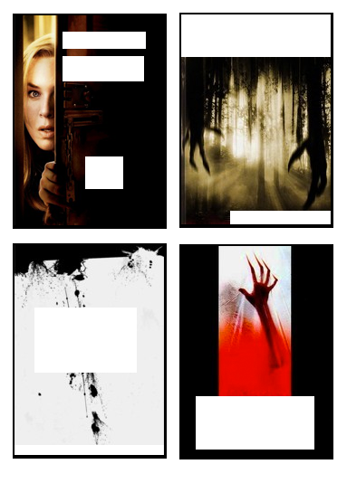
By now we’ve all heard the old saying never judge a book by its cover. And by now, as adults, we know that’s not so simple, is it? Whether you want to believe it or not, not a day goes by that you don’t judge things by their appearances. You judge people by what they wear, by how they talk, even by how they comb their hair—and it’s all on based on how you were shaped as a person: your life experiences combined with all those notions that you’ve been taught define something or someone as “normal.”
Is it fair? Of course not, (hence the saying).
But does it happen? Absolutely.
But how do you know if your opinion is based on certain preconceptions?
That’s the thing: you probably don’t even know just how often you’re judging that cover!
Let’s take a look at something we all judge (whether we realize it or not) – DVD covers of movies and television shows.
The entertainment industry understands this cover-judging down to a science. They want you to judge the cover, and they know you’ll do it – that’s the whole idea! So the objective is to provide as many hints towards the flavor of the movie within, all through the use of particular typography, colors and graphics on that 7.5″ x 5.6” rectangle. When combined, all these subtle hints give you a particular feel for the movie, so you’ll know what to expect.
This is why you’ll often see the same typography, colors and graphics used across the covers of movies belonging to a particular genre. Let’s take a look at some examples. (All movie images taken from Netflix.com.)
Classical Dramas
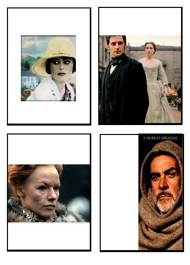
Most classical drama/period film covers are composed of the same elements.
Colors: Usually muted, often with a solid base or background containing either a lot of black or a lot of white.
Graphics: Usually consists entirely of men and women dressed in period clothing.
Typography: Often waffles between a thin serif font and a script font (sometimes including both).
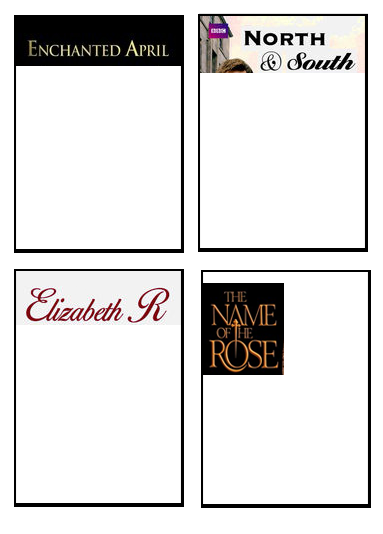 So take a look at these examples with all the elements put together.
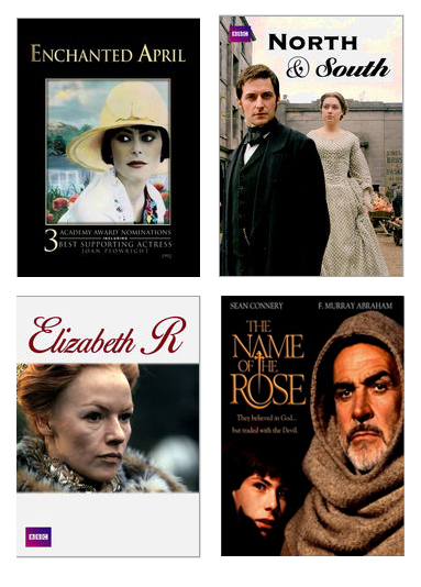 Based on these covers, you’ve already immediately judged these movies. Ladies, are these the types of movies you’d like to spend time watching? Maybe with your girlfriends? There’s a reason that most men stay clear from movie covers with these particular elements. And yes, I’ll admit it, because the particular structure of these elements, the covers turn out looking most dull.
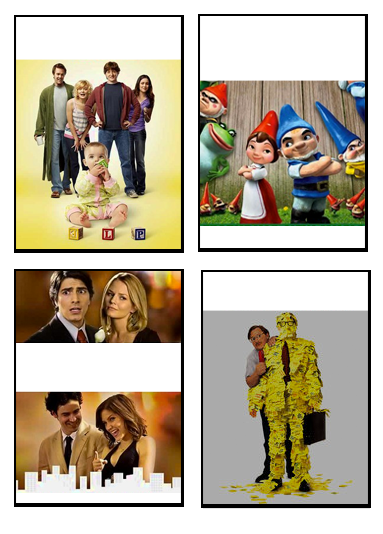
Comedies
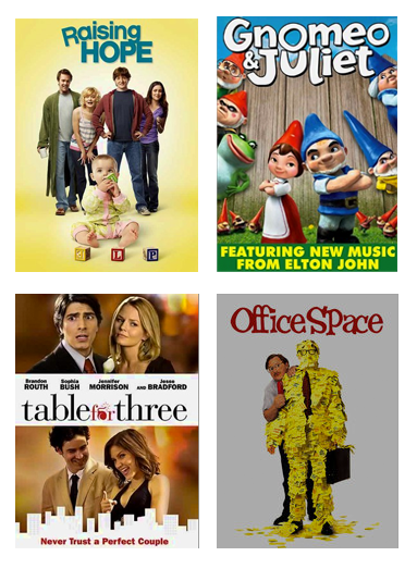
For obvious reasons, comedy covers want you to think fun!
Colors: Vary, but usually a lot of bright, fun, eye-catching colors.
Graphics: Usually people are portrayed in humorous situations, or with big smiles or goofy expressions.
Typography: Usually a decorative, fun font that’s imperfect in some way, such as mismatching the font baselines of one or several letters. Either serif or sans serif fonts are used. Sometimes graphical elements are added into the font, replacing letters.
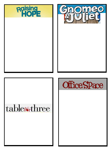 The general rule is to keep it looking and feeling fun! If you smirk at a funny or cute DVD cover, you’re more likely to choose to watch that comedy.
Sci-Fi & Fantasy
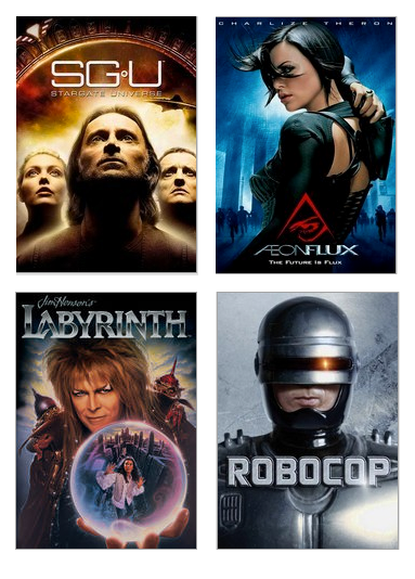
Fans of these genres appreciate either a futuristic look, or an otherworldly feel—and oftentimes both.
Colors: Most often more monochromatic, with a hint of color. Fantasy is often more colorful, while sci-fi uses more metallic colors.
Graphics: Usually an environment of outer space or unearthly or otherworldly lands. Can include robots, spaceships, strange creatures or aliens, often with a digitized look and feel.
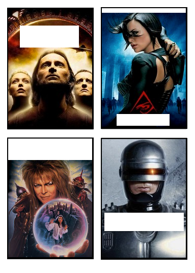 Typography: Usually a squared-off sans serif font, often with a metallic or otherwise shiny look and feel.
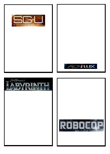 These covers appeal to fans of tales of wild adventures, usually playing out intricate plots stemming from another planet, universe or time frame.
Thriller & Horror
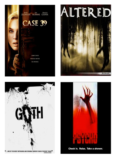
These typography, color and graphics combine to play to our fears.
Colors: Dark, usually accented with red.
Graphics: Spooky graphics, often blurred or otherwise mysterious. If a human is on the cover, the image is cropped, usually grotesquely.
Typography: Gritty, scratchy, grungy, messed up, altered fonts.
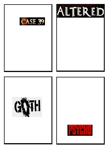 If a DVD cover looks like it’s about to jump out and grab you back into the dark, you assume it’s going to be a scary movie!
Of course, I’m using generalizations here. Not all films fall under the categories stated above. But let’s look at what happens when we eliminate these genre-defining elements.
I think we can agree that some covers just don’t say anything to anybody.
What are your thoughts about these?
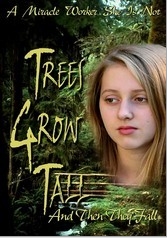 I feel this promotes bad typography, bad title, bad photography—and I have no clue which genre this could possibly be.
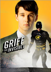 This one is either a spoof of a superhero, or just poorly laid out. It is strange, when you dissect the individual parts, it isn’t all that bad, but all these elements together? Yuck!
 Look at this unimaginative font choice and the purple-blue overtone on everything. Even Russell Crowe on the cover doesn’t tempt me to watch this one!
 To me, this one screams that anyone can just take a photo with their phone, slap some Times New Roman font on it and call it a movie cover?!
Next week at The Branding Spot, we’ll show you how you can use what you’ve learned here about combining typography, colors and graphics so others will “judge” your brand in the light you’re looking for: a cohesive brand that tells the story you want to tell the world!

