A great brand tells a great story – and the story of Christophe Artisan Chocolatier-Patissier comes all the way from France to charming Charleston, SC. Christophe Paume followed in his family’s footsteps, working in his father’s small chocolate shop in Toulouse, France. His continuing quest for knowledge, his passion for the sweet velvet of fine chocolate and his masterful attention to detail led him from Paris to Montreal to a stint in Indiana, where he met his wife, Carly – a like-minded chocolate connoisseur. Christophe and Carly finally settled in Charleston, opening their first chocolate boutique in the spring of 2009.
Christophe Artisan Chocolatier-Pâtissier specializes in visually stunning handmade chocolates created for consumers who appreciate high-quality European-style confections. Christophe and Carly now own two locations in Charleston, SC and they continue to delight in bringing the taste and look of fine French chocolate to America.
The Challenge:
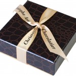
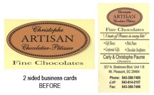
Upon opening their first shop, Christophe Artisan Chocolatier-Pâtissier’s branding was slim: a logo created by a French artist and packaging consisting of brown alligator-patterned boxes tied with a cream ribbon. Carly had created a few marketing pieces on her own, including business cards and postcards, but they didn’t really capture the essence of their unique story and captivating chocolates.
Like most new businesses, Christophe’s marketing and branding budget was tight. The challenge: to create an upscale, classy design, while sticking to inexpensive resources.
The Solution:
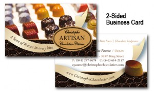
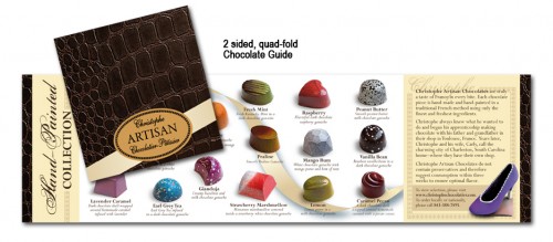
I LOVE European chocolate so it isn’t a wonder I met Carly and Christophe just a few months after they’d opened their first store. To keep things affordable, we decided to tie their existing brand elements into a solid and consistent new look. To do so, I decided to use the texture and color of the boxes as a base for the brand – it’s this style that creates the “look” that links all of their marketing pieces together.
Then, it was time to solidify the brand by showcasing what they do best: chocolate! We included close-up photos of their beautiful chocolates on all of their marketing materials – you’ll even find chocolate on their business cards. The level of detail on these hand-painted delicacies is a treat even for the eye, so naturally I wanted to stimulate the senses of potential customers with visuals you can almost taste. (And they taste as good as they look.)
The Result:
Simple, inexpensive, consistent branding on all their printed collateral. In Carly Paume’s words:
“It was wonderful to find Nora when we did. We needed a boost in our marketing materials that we had plus we needed some new materials. Although I didn’t know exactly what I wanted, Nora could see my vision through the words I could hardly get out and incorporate that into some wonderful pieces that we have, including our business cards and chocolate guidebook. She listens even when you’re not talking – and that’s a gem because some graphic designers don’t even listen when you are.”
Are your marketing materials just not cohesive? I can help! I am offering Spot-On Brand Alignment, where you email me three of your collateral pieces and I give you 10 individualized tips on how you can make your branding more effective. Email Nora at info@ndrichardson.com, now for a discounted rate of $299 (valued at $500).
Share this post: Facebook It | Stumble It |


Trackbacks/Pingbacks