While sitting at my local taco hotspot, (aptly named The Taco Spot — what can I say, I have a thing for their name), I took notice of their LARGE selection of hot sauces. You can learn a lot about branding by looking at other products and brands. Let’s take a look at what constitutes HOT Branding by analyzing the top three most common Hot Sauce brands found in my neck of the woods.
Have you every really looked at your favorite brand of hot sauce? I bet your brain hones in on the label of your taste buds’ favorite choice. Do diamond-shaped labels or wooden caps make your mouth water, or is it a certain shape of bottle that catches your eye? Let’s take a look at how a few common hot sauce brands differentiate their brands from others in their industry, causing you to choose one over another in the grocery store. (Disclaimer: I’m not grading each brand on the flavor of the hot sauce or on its ingredients – we’re only talking hot sauce branding!)
Cholula
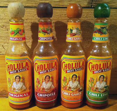
By far the most consistent hot sauce bottle and label come from Cholula. (Please forgive the quality of the photographs.)
A product of Mexico, the Cholula label gives the impression that inside these bottles is one senora’s (possibly secret) family recipe. The use of color for each different flavor is well thought out. The wooden cap calls to mind ideas of natural contents (whereas a plastic cap might convey the opposite). I feel that the wooden cap is very intentional, doubling as a differentiating element from other hot sauces. The whole package says this is a high quality brand.
The Cholula brand uses identical bottle shapes, with the same di-cut label, and the same consistent brand colors across all varieties. This brand also has a good grasp for flavor coloration, and a distinctly recognizable wooden cap.
Hot Branding Results: I give Cholula an A.
Tabasco
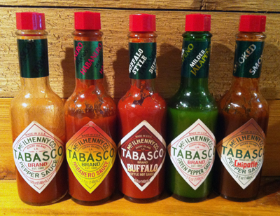
TABASCO® Brand Hot Sauce does a good job branding their product consistently. (I also suspect Tabasco executives know the brand might be at risk of brand genericide.)
Seeing as the same Louisiana family has run the Tabasco business for 140 years, they’ve had plenty of time to get their branding right. Each Tabasco product is found in a slightly squared-off bottle with a very distinct diamond-shaped label, and a red faceted cap. Color variations on the diamond-shaped labels indicate flavor distinction. However, I don’t feel this use of color distinction offers that same stand out brand clarity as the Cholula brand. Plus, I’m left feeling a bit betrayed by the label designers due to the Buffalo label. The bottom half of the label goes completely against the brand’s consistency. And check out Chipotle—that label goes a bit out of bounds as well. Why change now?
The Tabasco Brand offers the same distinct bottle shape with the same di-cut label shape and faceted caps across all flavor varieties.
Hot Branding Results: I give Tabasco Brand a B+.
Texas Pete
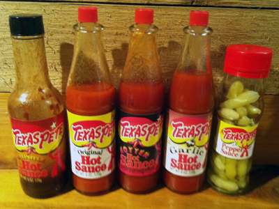
Texas Pete’s branding isn’t nearly as rock solid.
Despite the name, Texas Pete Hot Sauce isn’t made in Texas, but rather in North Carolina. As stories go, Texas Pete does have an endearing narrative, so they do get an A for brand messaging—but I can’t say the same for plain ol’ across the board consistent branding. While some of the bottles are that recognizable pointy shape, the others are completely different. Same with the red cap: some Texas Pete bottles have it, while others don’t — and the shapes vary, too. And while all the labels display consistent brand colors, including red, yellow, white, and black – as you can see, when placed all together, it’s a hot (branding) mess! The secondary fonts are all different, and the label coloration just isn’t as cohesive when the varieties are placed together as a team or collection. These label designs don’t say Brand Alignment at all.
In terms of brand alignment and consistency, the Texas Pete brand’s only asset is the consistent use of brand colors on the labels.
Hot Branding Results: I give Texas Pete a C+.
(Perhaps if the Chipotle hot sauce was in the same red-capped pointy bottle, I would’ve likely given the brand a B-. That bottle shape and small red cap are the distinguishing features of the Texas Pete brand. So why would they throw that defining brand element away?)
Hot Branding Review
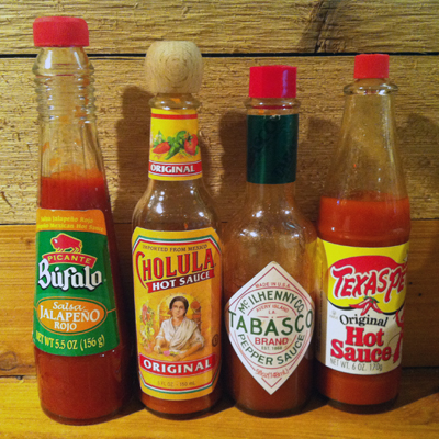
Let’s look at all these hot sauce brands together:
At first glance, each hot sauce stands out because each bottle shape is different. After that, other brand characteristics jump out, such as the white diamond shape, the only cap that isn’t red plastic, and the heavy amount of green on only one label.
Your Branding Should Be HOT
This exercise illustrates the way you should be thinking about your company’s branding materials. Analyze the shape, color, and graphics for consistency and against the competition. Your brand needs to stand up and stand out on the “shelf” against each of your competitor’s brands.
What makes YOUR brand HOT? Which brands catch YOUR eye in the grocery store? Leave a comment below!


