Color is powerful. Color is dangerous. Used correctly, color digs deep inside of us, urging us to act, pouncing on our instincts, and releasing our emotions into the wild. Most of us experience raw reactions to color, even if we’re not conscious of color as that catalyst. Many of these reactions are illogical, stemming from passionate or painful memories long past. In other words, our life experiences change our opinions on color.
Think about your favorite colors, then think about the colors of your favorite brands. Do your lists overlap? Aside from personal preferences, every color casts a unique impression that unites groups of us because of our mutual experiences as human beings. For example, black can been seen as authoritative and powerful – or classic, elegant and sophisticated – or even mysterious or scary. Blue is often listed by many of us as a favorite color (especially men). Blue can be viewed as trustworthy, dependable and productive – but to others, blue feels soothing, calming and serene.
When choosing your brand colors, always consider:
- Consumer Preferences
- Consumer Expectations
- Brand Message
- Competitors’ Colors
- Color Psychology
Color is your brand’s strategic asset. It’s your secret weapon. Your brand must be irresistible to your target market.
Choosing the right color for the right reasons results in a profitable brand.
Consider these examples…
UPS
Color Psychology: The color brown is shown to evoke words like “stable” and “reliable.” Not to mention, the color brown has long been the color of shipping boxes and brown paper packaging. Therefore, the brand message from the brown UPS color is very clear and exceptionally effective!
Big Brand Idea: In 2002, the UPS marketing team took the existing brand strategy to entirely new heights by introducing a new slogan as part of an aggressive marketing campaign:  What Can Brown Do For You? Because brown simply isn’t a popular brand color (especially in the shipping industry) and they already owned market focus on their existing, instantly recognizable trademark color – UPS was able to further capitalize on their brand with a slogan based entirely on only their color’s symbolism.
Jolly Green Giant
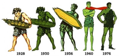
Color Psychology: In the 1920’s, a small Minnesota company was looking for a mascot for their fresh vegetables. On the first go-around in 1928, what we know today as the Jolly Green Giant looked more like a grumpy gray gnome!  This first mascot didn’t perform well, and did nothing to increase sales. Why? Gray is a moody and depressing color – and, above all, it’s downright unappetizing. But what about green…?
Big Brand Idea: The color green symbolizes happiness, nature, calm and good health. So, over the years, the giant grew taller, happier, and much more GREEN. The public embraced the Jolly Green Giant as a sign of fresh, healthy produce.
Apple
Color Psychology: The signature Apple logo has changed quite a bit over its lifetime. The original logo was black and white, but way too ornate and overly complex. Steve Jobs stepped in to simplify the logo into an easily recognizable, rainbow-colored apple with a bite taken out of it. The rainbow colors made sense for many reasons: it was the 1970’s and the rainbow was an inviting array of colors to the generation; plus, Apple was the first company to introduce full-color computer screens in an era dominated by DOS: yellow or green text on a black screen. (Icky.)
Big Brand Idea: After 22 years with the rainbow apple, Steve Jobs returned to Apple with a ton of ideas for change. He correctly asserted that the rainbow apple no longer spoke to their  product line, now known for simple, effective, intuitive, minimalist, sleek technology. (Plus, the whole world went color quite awhile ago, so color as a feature was no longer a selling point.) So, the apple went monochrome in 1998. In 2003, the slick, shiny, silver glass-themed logo unveiled an ever-futuristic Apple angle of rebirth, purity and simplicity – just like their new products.
—
The key to a great brand is well-thought-out use of color, because the right color speaks to the fears, passions and desires of our target audience. Color actively and purposefully evokes emotion in a way that no other brand component can. So, even if your brand is small, it doesn’t mean you can’t look and act like a big brand by choosing colors that speak to your target market.
