Today’s desktop publishing software is more easy-to-use and more accessible than ever—and it’s a far cry from what it looked like close to two decades ago, when I entered the field of graphic design. Despite these advances, industry professionals and consumers alike expect professional design, and, even when they can’t put their finger on it, they can tell a do-it-yourself designer from a true professional. Take heed: so, if you cut corners on design, it could be more obvious to your target market than you might think!
Most tell-tale DIY design issues are a result of an attempt to use software that’s simply not built for graphic or typography design. These programs (*ahem* Microsoft Word) don’t give you the authority to manipulate the text as you see fit. Basically, these programs think they’re smarter than you: because clearly, it knows more about “proper” typography than you do.
Tell-Tale Signs of DIY Design:
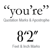
- Straight Quotes. Actually, straight quotes (two straight hash marks) are inch marks, while single straight quotes are foot marks. Real opening and closing quotation marks curve toward the words housed between.
- Double Returns. Sure, hitting the return or enter key twice between paragraphs (or after headlines) separates the text—but it also creates huge, awkward gaps in your layout.
- Two Spaces Following Punctuation. I’ll admit it: I still fall victim to this one. It was my ninth-grade typing teacher; she was way too good at her job! See, using two spaces after punctuation made sense back in typewriter times. Standard monospaced typewriter fonts, like Courier, made it hard to distinguish between the one space between sentences and the one space between words. Since the advent of the computer, fonts have grown smarter. Most fonts used today are proportional fonts, designed to tuck the letters closely together, when need be, avoiding unsightly gaps in your body of text. This particular “rule” is one I still have to work to forget. (Stupid typing class.)
- Centered Alignment. Most amateurs use centered alignment. For everything. Here’s the news: unless you’re laying out a formal invitation, don’t even think about using centered alignment. Why? Because it’s simple and safe, and therefore B-O-R-I-N-G!
- Borders Around Everything. This is another “safe” technique: containing your text in a box. This has the opposite of the intended effect, because, more often than not, the text looks trapped and suffocated—those barriers are only stifling the message.
- Half-inch Indents. I know, I know–if Microsoft thinks it’s okay, then, hey it must be ok! I mean, how could a multi-billion dollar company (designed by computer geeks, at that) get this typography tidbit wrong? And though your ninth-grade typing teacher might agree, this is an overused and outdated standard. Paragraphs can be indented with as few as two spaces, depending upon the other properties of the typography.
- Underlining. DO NOT be tempted to underline text for emphasis, even though your software will almost always give you the option. Underlining is completely antiquated. It does nothing to emphasize text; it actually decreases legibility. Want to know more? Learn all about effectively emphasizing text to attract your target market.
- ALL CAPS. Our minds read words based on the specific shapes of the letters combined—in other words, we read more smoothly when we can easily identify the shape of each word. WHEN EVERYTHING IS IN ALL CAPS, you lose your ascenders and descenders, so all the words have the same shape. Want to know more? Click here to understand when To Cap or Not To Cap!
We hope you enjoyed our March Typography Series here at The Branding Spot! We’re also really excited about next month’s theme: Color! Stay tuned!
