We’ve seen a LOT of huge companies sporting new logo designs over the past year or two. Seems like everyone is turning in their former flowery corporate logos for a look that’s a lot more simplistic (and often a little too bland, in my opinion).
Don’t get me wrong: minimalism is awesome. In designing a logo, a minimalist will strive to evoke the pure, core essence of an idea, represented in the most simplistic fashion possible. When branding and design experts accomplish this feat, it is spectacularly effective. One might even argue that ALL great branding is a nod toward minimalism.
But simplicity for the sake of simplicity? Purely pointless.
Branding Trends: An Oxymoron
This recent trend in simplistic, highly publicized rebranding endeavors is puzzling. It’s become a trend, and it is therefore unimaginative. When everyone’s doing the same thing, individual brands risk losing their meaning, their personality, and all the brand equity they’ve built up through their previous branding. Remember: it’s always easier to retain your existing customers than to reach new customers from scratch.
Let’s just say it’s rather obvious when a company decides to rebrand simply to follow a trend—which is probably the worst reason to rebrand…ever. You don’t brand or rebrand to follow a trend! You brand to tell your unique story, to be memorable and easily identifiable, and to attract your changing target market.
You must always have a real (and good!) reason to rebrand your company. If you think your logo is outdated and you need a more modern look, that’s a reason. If you’re opening up a new product line to target a new audience, that’s a reason, too. There are many reasons to rebrand, just be sure you have a good one. For example, trying to hide from bad publicity? Nope, that is NOT a good reason. It’s a bait-and-switch: you’re not drawing attention away from that bad publicity; you’re only making your mistakes more obvious. Trust me, it’s only a band-aid approach, and you will be found out.
If you have a valid reason and you’re seeking out a rebranded look that says Minimalism, then your brand must provide that crucial focal point that your audience will respond to. True minimalism will create that tiny subconscious spark of recognition. And that’s exactly the type of effect you want: a detail truly branded into the mind of each potential buyer, the spark that leaves them always wanting more.
Simplicity vs. Minimalism
Notice how I’m talking about a trend toward simplicity, not a trend toward minimalism. Call me what you will, but many of these recent rebrands are just plain poorly thought out and simpleminded, rather than a truly perfected capture of essence.
Let’s take eBay for example. Once an online garage sale and auction site, eBay has evolved into a global marketing channel, allowing everyone from regular Joes to larger businesses to launch their own online stores to sell (often unique) goods. With seventeen years since their original branding, eBay saw a colossal change in not only what the company offers, but also how it operates.
 When an evolution like this takes place, adaptation through new marketing strategies is absolutely necessary. Even if the change is gradual and organic, a new brand must be developed to reposition the business: ensuring the experience of working with the company is communicated and delivered as promised through that new brand.
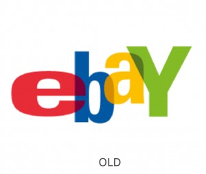
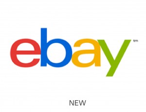
So eBay had several excellent reasons to rebrand—and they did, launching a new logo in September 2012. The new brand was an update to the original logo, a hodgepodge of colors and overlapping fonts. While a little goofy looking, it was definitely a fun and memorable brand. But the recent redesign is simply the original colors paired with an indistinct lowercase sans serif font with awkwardly tight kerning (meaning there is little space between the letters).
 The new logo is entirely too simple, and therefore, forgettable. It doesn’t capture the essence of anything; it just sits there. Looks like eBay is yet another company that fell for the trend towards simplicity, with no care for effective minimalism.
What do YOU think about the trend toward simplicity, especially in favor of minimalism? What do you think about eBay’s new logo? Leave a comment below!
