Do you know the three main elements that make up your company’s brand? They are Typography, Color and Graphics. For the next three months, we will be talking about these elements. This month we will be talking about Typography.
.
.
What is Typography?
Typography is the practice of properly applying text into your marketing and advertising and is a crucial component to your brand. A large part of great typography is picking the right typeface/font. The right (or wrong!) choice in typeface evokes both emotion and word/image association, immediately and often subliminally. The right font choice also brings personality to your marketing. But it’s not all fun and games! Whether you like it or not, your audience is judging you by your font choices – from good to bad to everything in between.
What are you saying?
With the advent of personal computers, a wide variety of fonts have spoiled recent generations into believing that branding and marketing is as simple as choosing a pre-loaded font. It really isn’t that easy. You need to know what you are saying. To be unique and memorable, you have to think about your brand, your brand messaging and your ideal audience’s expectations. Only then can you pick a font for your brand. It’s simple: you don’t choose a font because it is the default, you choose a font because it enhances your brand messaging.
So it’s important to pick the RIGHT font.
From Fierce to Fun & From Dear to Dinner
Typography is immensely powerful simply because great typography goes nearly unnoticed.
How about an example…
Two words: LION -and- LAMB. Two animals, yes – but one is considered strong and majestic, while the other can be considered soft and cute.
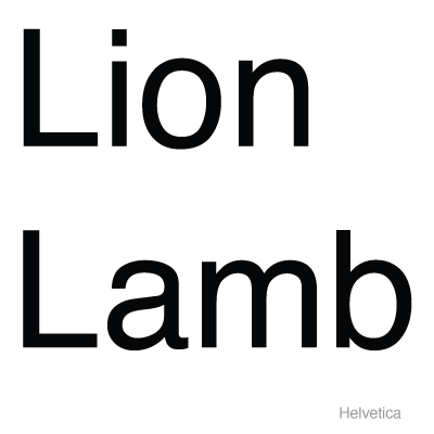
First, let’s look at these words in Helvetica.
Does each word tell you anything about each animal’s personality? No. It’s just a nice, easy-to-read font. In other words, this font is safe. You simply read each word with little emotion and likely no association. In Helvetica, Lion and Lamb are simply words.
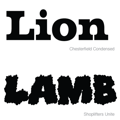
Now let’s make a change.
A noticeable difference, right? How do you feel about each word now? The word Lion is set in a strong, slab serif font; it clearly says strength and power. And can’t you just see and feel that fluffy little Lamb?
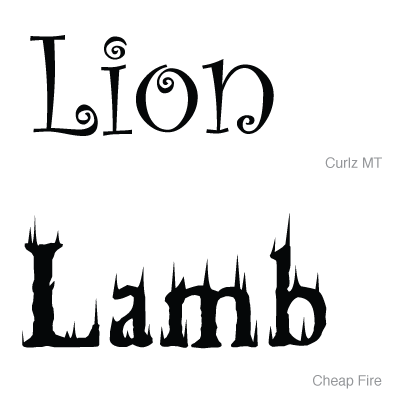
Ok, let’s change it up a bit more!
This Lion isn’t king of the jungle anymore. He could very well be a happy, harmless lion from a children’s book. And the Lamb just went from fluffy and cute to being what’s for dinner!
Lambs Become Lions
That’s the power of typography – the SAME word in a DIFFERENT font:
- Changes the entire feel of the word
- Determines context
- Tells a new story
- Inspires different visual and mental associations
- Creates word personality
- Speaks to a new or different audience
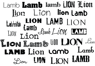
And just think you can get all of this across without color or graphics. Now that is powerful. Take a look at the words Lion and Lamb in a variety of fonts.
How do you see each animal when you look at each font? How do you feel? What story does each word personality tell you?
Your Turn: Now take a look at the typeface and the overall look and feel of your current branding. Do you clearly see and feel your company’s voice, mission and value subliminally reflected in your typography? If you’re not sure, it’s time to ask yourself the hard questions and be honest with your answers. Does your brand’s personality match how you want your target market to see your company? Is your brand telling your story? If you’re not proudly stating YES to each and every one of those questions, it’s time to reevaluate your brand! Your success depends on it.
NOTE: Be aware that this powerful tool can be easily overused and abused. Remember you want it to be subliminal in your branding, not clubbing your target over their head.
Do you need help with understanding your brand’s typography? A Brand Alignment is the perfect way to get great, practical advice that you can implement immediately. Find out more here.


