Now that I’ve taken away your Mixed Caps for emphasizing text… NOW WHAT? See what I did there? 😉
Really though, now what? (Hint: what makes this text stand out even more?)
Ah, the nostalgia of the typewriter. I remember my very first manual typewriter, just as well as I remember that powerful hum when my first electric typewriter came to life. Despite the fond memories, that was then: typewriters limited your typographical expression. But now, computers can give you full freedom to effectively express yourself.
So it’s time to make your e-books and articles look sophisticated, and say farewell to the typewriter age.
Seven Ways to Emphasize Text:
- Italicize
- Bold
- Different Font
- Change Size
- Use Space
- Add Color
- Reverse Type
Italicize
The typewriter’s way of faking italics was to use underlining, because that’s essentially all it could do. To ease the transition to computers, word software was developed to mimic many typewriter features, including the underline. But the underline is NOT an effective way to emphasize text, especially when you have the easy option of italics.
Let’s take a look:
“You can do a good ad without good typography, but you can’t do a great ad without good typography.” Herb Lubalin
“You can do a good ad without good typography, but you can’t do a great ad without good typography.” Herb Lubalin
As you can see, sure, the underline draws your attention to the sentence, but it’s not so inviting to read, is it? That’s because the underline cuts off the descenders (the portion of the letter that falls below the baseline of the word, such as g, p, & y). Unfortunately, we have to concede to the fact that on the web, links are usually underlined (too bad they didn’t consult me). Anyways, want to look really redundant? Underline an already italicized word. Doesn’t that look awful? Don’t do it!
Typography Tip: Italics are meant to emphasize a word, a phrase, or maybe even a short sentence. Don’t use it for long bouts of body text.
Bold
When italics just aren’t dramatic enough, in steps your friend bold.
“Boldness has genius, power, and magic in it.”
Goethe
But bold is a fickle friend. Too much bold can be a bad thing. For example, if you bold an entire sentence, nothing about that sentence stands out as important; plus, it can cause the words not in bold to actually stand out more. Catch my drift?
For additional emphasis, go ahead and break out the bold italic, or you can even choose the extra bold or heavy version of your typeface.
Typography Tip: Be careful when using extra bold versions of type, as they are frequently not as legible.
Different Font
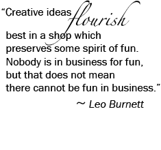
Another great way to emphasize text is to pick a contrasting font. If you’re using a serif font like Times Regular as your body text, why not use a sans serif font like Helvetica Thin to add a different feel to a word? Or, if your word is fancy and you want to enhance it, why not put it in a decorative script, like below?
Typography Tip: When using two different fonts, you may need to adjust the point size so your text is cohesive and readable.
Speaking of…
Change Size
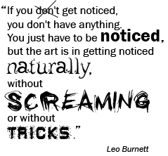
Dare to pack a real punch by enlarging or minimizing a word or phrase. I say, have fun with it – go to the extremes! Size allows words and/or punctuation to become their own design element. (I felt this quote not only needed extreme size, but different fonts and some visual clues.)

Typography Tip: When using differently sized fonts, you may have to increase or decrease the space around individual letters (kerning), the space around words (tracking), or the space between the lines (leading) to create a harmonious feel.
Which brings me to…
Use Space
Adding more or less space around your letterforms is essential when you’re playing with the size of your words. And, hey, don’t be afraid of large empty space (also called negative space).
.
.
Need I say more?
.
.
Advertisements made up of lots of negative space get noticed and read more often; it’s been proven to staggering percentages. Know why? Well since the above statement ‘Need I say more?’ is surrounded by white space, it makes the statement seem more important and makes you keep reading. I mean weren’t you more curious to find out why that statement was out there alone? So, to all of you readers just skimming this article…gotcha!
Typography Tip: If you want to be funky and create a grungy or young and hip style, you can decrease the leading, so the text is bumping into or overlapping the text on the line above.
Add Color
Color is powerful. Color is dangerous. That’s why there are rules around color that you must take into consideration.
The most important rule: limit the number of colors you use. I recommend limiting yourself to just two. More than three and you start getting the rainbow effect, which looks amateurish. Using just two colors, you’ll notice that the less the second color appears, the more dramatic it actually is.
Typography Tip: Warm colors (like reds and oranges) are the most powerful, so use them minimally for a brief pop of color. Cool colors (like blues and greens) are less overwhelming and can be used more throughout your design.
Reverse Type
Reverse type refers to white type on a dark background and it can be an attractive way to accentuate and enhance your text. However, non-designers abuse this idea by overusing it, which looks terrible, so please, use reverse text with care.
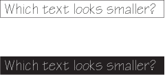
Check out this optical illusion:
White text on a dark background tends to look smaller than the same-sized black text on a white background. So be aware you’ll probably need to bump up the point size.
Watch your font choices! Sans serifs work best because there’s consistent stroke width throughout each letter, whereas serif fonts have thick and thin strokes within a single letter, making it much harder to read when reversed.
Typography Tip: To ensure the best possible outcome select a bolder font, especially if using a serif font.
Overemphasis Is NOT Your Friend
Any and all of the above examples of emphasis can work for you and look modern and professional. However, the key to emphasis is to use it sparingly. Emphasize everything and you’ll have the opposite effect. If it helps, read your text out loud and see which word(s) really stick out in your mind. And another thing: don’t try combining too many types of emphasis. When applied to one word, it starts to look ridiculous, and it distracts from your message.
“Create your own visual style… let it be unique for yourself and yet identifiable for others.”
– Orson Welles


