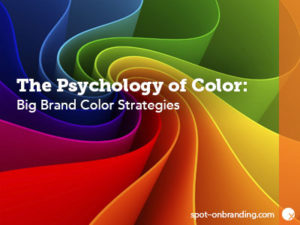
This popular post was first published April 17th, 2012. Newly updated 11/15/16 to bring you more great info about the psychology of color in branding and marketing!
Color is powerful. Color is dangerous. Used correctly, color digs at emotions we have deep inside of us, urging us to act, pouncing on our instincts, and releasing our emotions into the wild. Most of us experience raw reactions to color, even if we’re not conscious of color as that catalyst. Many of these reactions are illogical, stemming from passionate or painful memories long past. In other words, our life experiences change our opinions on color.
For example, did you know…?
- Color increases brand recognition by up to 80%, according to a University of Loyola, Maryland study.
- Research from CCI Color Institute of Color Research reveals people make a subconscious judgment about a person, environment, or product within 90 seconds of initial viewing and that between 62% and 90% of that assessment is based on color alone.
- Ads in color are read up to 42% more often than the same ads in black and white. – Jan V. White, Color For Impact
Have you ever wondered what your favorite color says about you? Our color choices say a lot. We even ask our friends, “What’s your favorite color?” (…and then perhaps judge them accordingly!) Why do we even care? Because color is all around us, and whether we know it or not, colors impact tons of everyday decisions, from what we wear to what we eat, to what we buy. Different cultures react to colors in different ways, too. So, in addition to personal preferences, the reasoning and psychology behind your favorite color is about as varied as your choice of a favorite song or food.
One thing is for certain: As human beings, we all have innate reactions to color that drive a lot of our decisions (whether we realize it or not) and it’s all because of the meaning behind each color. For example, black can be seen as authoritative and powerful; classic, elegant and sophisticated; or even mysterious or scary. Blue is often listed by many as a favorite color (especially men) and because it’s a color of trustworthiness, dependability, and productivity. But, conversely, to others, blue feels soothing, calming and serene. Red is the color with more personal associations than any other color—meant to draw attention and invoke excitement and energy.
Think about your favorite colors, then think about the colors of your favorite brands. Do your lists overlap? (See how color psychology is an important component of brand psychology?)
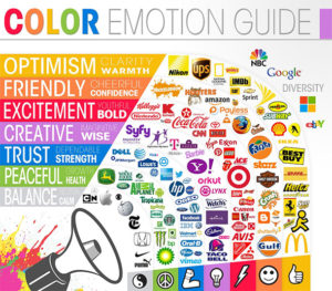
Color Emotion Guide Infographic courtesy of The Logo Company.
Using Psychology of Color in Branding and Marketing
With all the different meanings behind each color and all the different reactions different people have to different colors, it’s vital marketers and branding experts put careful consideration into the colors they choose to represent their brands.
When choosing your brand colors, always consider:
- Consumer Preferences: Are you picking a color that’s widely unpopular or linked to sad and uneasy emotions? Does your color choice encourage brand trust?
- Consumer Expectations: Your customers want to feel a certain way after buying your product or engaging on your services. Color and appearance are just as important as performance and utility.
- Brand Message: Think of what emotion you want your brand to invoke. Your brand colors should match that emotion as closely as possible.
- Competitors’ Colors: If you don’t want to be lost in the sea of competitors in your industry, pay close attention to the colors of their brands. Your brand should stand out—while still sending the brand message you want.
- Color Consistency: Once you’ve established your brand colors, they should ALWAYS remain exactly the same. Consist brand color solidifies your brand in the mind of your target market.
- Color Psychology: Know what every color really means: NOT just what YOU think it means.
The most important thing to remember when thinking about the psychology of color in marketing and branding is that color is your brand’s strategic asset. It’s your secret weapon. Your brand must be irresistible to your target market.
Choosing the right color for the right reasons results in a profitable brand. After all, there’s no branding tool truly as powerful as color.
Color Psychology at Work: Brand Examples
The psychology of color in marketing and branding, as a concept, has been a focal point in the branding industry for quite some time. For years, brands have been testing, retesting, tweaking, and solidifying their brand message and logos with color modifications. If you look back at the history of some of your favorite brands, you’re bound to notice some logo changes, brand makeovers, and rebranding over the years. This is because more research into the psychology of color has been conducted, causing brands to rework their logos to better target their ideal customers.
For example, consider some of these well-known brands and their transformations over the years:
UPS
Color Psychology: The color brown is shown to evoke words like “stable” and “reliable.” Not to mention, the color brown has long been the color of shipping boxes and brown paper packaging. Therefore, the brand message from the brown UPS color is very clear and exceptionally effective!
Big Brand Idea: While UPS is immediately associated with the color brown, it hasn’t always been that way. When the company first started using vehicles for delivery, owner and founder James E. Casey wanted delivery vehicles to be painted a wide variety of colors so the public would recognize his cars as a fleet—not just one delivery vehicle. It wasn’t until 1916 that Charlie Soderstrom joined the UPS team and suggested the color brown for two reasons: First, the color reflected the Pullman rail cars, which were synonymous with class, elegance, and professionalism. The second reason? Dirt is less visible on brown uniforms and vehicles.
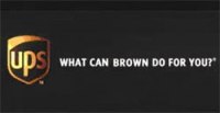
In 2002, the UPS marketing team took the existing brand strategy to entirely new heights by introducing a new slogan as part of an aggressive marketing campaign:
What Can Brown Do For You? Because brown simply isn’t a popular brand color (especially in the shipping industry) and they already owned market focus on their existing, instantly recognizable trademark color, UPS was able to further capitalize on their brand with a slogan based entirely on only their color’s symbolism.
Jolly Green Giant
Color Psychology: In the 1920s, a small Minnesota company was looking for a mascot for their fresh vegetables. The company’s first product was peas—but not just any peas; giant peas that were significantly larger than any other pea variety being grown on the market. This giant theme stuck, but the first try was a near-miss; the “giant” looked more like a Grumpy Gray Gnome!
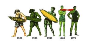
Image courtesy of The Green Giant Story.
This first mascot didn’t perform well and did nothing to increase sales. Why? Gray is a moody and depressing color…and, above all, it’s downright unappetizing. But what about green…?
Big Brand Idea: The color green symbolizes happiness, nature, calm and good health. It is also, naturally, the color that comes to mind when most think of vegetables. So, over the years, the giant grew taller, happier, and much more GREEN. As their product line grew to include more vegetables like corn, green beans, and veggie melodies, the Giant grew too, evolving with the brand. The public embraced the Jolly Green Giant as a sign of fresh, healthy produce. There is now even a statue of our beloved Jolly Green Giant in Blue Earth, Minnesota!
Apple
Color Psychology: Apple’s original logo was far from the easily-recognizable apple we all know today. Designed by Steve Jobs and Ronald Wayne, the first logo was revealed in 1976 and featured an intricate portrait of Isaac Newton sitting beneath an apple tree. While the colors were drab (black, white, and grey) the message behind the logo was clear: Isaac Newton discovered gravity from an apple falling from a tree, a discovery of knowledge that changed the world. The original logo also featured a quote from William Wordsworth: “Newton… a mind forever voyaging through strange seas of thought… alone.” Despite the company’s tribute to the father of knowledge, Jobs wanted to make more of a statement to the company’s mission, thus commissioning it’s transformation in 1977.
![]()
Image courtesy of Wikimedia Commons; licensed for use under The Public Domain.
Big Brand Idea: Apple’s brand strategy has always focused on emotions and the colors used in the ever-evolving logo have reflected that strategy over the years. The rainbow logo spoke of imagination, innovation and advancement. The apple design was a nod to the discovery of gravity and the importance of advancing knowledge. In the 1970s, lifestyle choices were changing and evolving, reflecting a more colorful and eclectic way of life. Apple brought color into a marketplace where color had not been seen before. By introducing the colorful iMacs (later in their product line), Apple reinvigorated a brand that had suffered $1.8 billion of losses in two years.
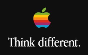
Image courtesy of Wikimedia Commons; licensed for use under The Public Domain.
The Apple logo stayed true to that branding for nearly 20 years until yet another logo change reflected Apple’s brand personality shift. The focus then became simplicity. Apple was striving to make products that emphasized their humanistic and simplistic connection with technology. A sleek black logo spoke to these traits, followed by the white and chrome renditions we see today. The futuristic angle represented rebirth, purity, and simplicity—all reflected in their continually advancing products.
—
The key to a great brand is well-thought-out use of color, because the right color speaks to the fears, passions and desires of our target audience. Color actively and purposefully evokes emotion in a way that no other brand component can. So, even if your brand is small, it doesn’t mean you can’t look and act like a big brand by choosing colors that speak to your target market.
Branding not working? Need a fresh look at your brand? Outside eyes can help you reach your customers more effectively. Contact Nora D. Richardson at Spot-On Branding if you need help with your current branding or if you’re considering a rebrand.
 |
Nora D. Richardson is the CEO and Branding Expert at Spot-On Branding, a full-service branding agency in Charlotte, North Carolina and Charleston, South Carolina. Spot-On Branding helps CEOs who want to increase their bottom line but are unsure how to brand and market their already successful referral-based businesses. |