Fashion designers, artists, and other highly visual types are inspired by what they see in the world around them. So if they’re seeing a new color fashion trend in bloom this spring, get ready for more logos and graphics with these “in” seasonal colors. That’s right, fashion trends and new brands go hand-in-hand when it comes to color.
Check out Pantone’s fashion color report for spring of 2013 here. Looks like soothing neutrals paired with energizing brights will be/are all the rage this spring.
Have these hues inspired thoughts of a brand makeover for your business? Let’s take a closer look at this exciting spring color palette to discover what these fun colors could be saying about your brand. Before you continue, visualize your target market. Of those described below, which particular description(s) might they associate with your brand, company, product or service?
GREENS
Greens bring to mind feelings and thoughts like refreshment, fresh, healing, soothing and nature. Bright greens are associated with grass, while emerald greens are seen as elegant. Deep greens signify money and prestige. Green is trustworthy. Bright yellowy greens like chartreuse are trendy and youthful. Olive greens are most associated with army camouflage and that popular avocado hue takes us back to the 60’s and 70’s. Seafoam is a soothing color, claimed by many organizations in the spa and alternative healing arts industries.
Pantone Spring Greens
Tender Shoots (14-0446): vibrant yellow-green.
Brand buzzwords: Artsy, Sharp, Bold, Trendy, Slimy, Refreshing, Lemony, Tart
Emerald (17-5641): a trustworthy color that reminds us of riches and jewels.
Brand buzzwords: Refreshing, Trustworthy, Restful
Grayed Jade (14-6011): subtle green with gray undertones.
Brand buzzwords: Cool, Liquid, Healing, Cozy, Subtle, Soft
REDS
Reds are aggressive in nature; people often interpret the color red as one that commands attention and demands action. What kind of action? Well, red not only increases our appetite for food, but it also excites us on a more passionate and provocative level. (Fast food companies have long known these hunger-inducing effects. Think McDonald’s.) Red is exciting and dynamic. Why do you think so many sports cars come in red?
Pantone Spring Reds
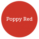
Poppy Red (17-1664): a yellow based red = high arousal.
Brand buzzwords: Exciting, Energizing, Sexy, Hot, Stimulating, Aggressive, Powerful
ORANGES
Oranges suggest some of the drama of a red, but are tempered by the cheerful yellow. Orange is seen as energizing, inviting, friendly, vital and even tangy. Children respond well to orange. As for adults, most either like orange or don’t like it at all: people tend to choose a definite side regarding orange, to a stronger degree than any other color. Orange is very eye catching. Like red, it also stimulates the appetite; orange colors in foods suggest tastes of the fruit. Orange is also well known as the safety color. Lighter shades of orange, such as peach, apricot, coral and melon are seen as sophisticated and appealing.
Pantone Spring Oranges
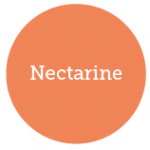
Nectarine (16-1360): an energetic orange with a soft hint of sophistication.
Brand buzzwords: Fun, Whimsical, Childlike, Happy, Glowing, Vital, Sunset, Juicy, Tangy, Energizing, Gregarious, Friendly, Loud
YELLOWS
Yellows are seen as luminous, warming, sunny and cheery. Think daffodils, lemons, and bananas. Think the sun. Yellow is associated with tastes of citrus. The more cream-colored yellows are seen as more sophisticated. Yellow is used as an accent color on products because of its ability to blatantly call attention to you from the shelf. It is the most visible and eye-catching color.
Pantone Spring Yellows
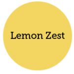
Lemon Zest (13-0756): a cheery yellow with a touch of green.
Brand buzzwords: Lemony, Tart, Fruity, Acidic
BLUES
Blues are dependable, constant, and trustworthy—as well as quiet, clean, cool and serene. Whole industries, including IT companies, banks, and financial institutions have taken to blue and they’re not giving it back! Blue is the most loved color by both males and females, likely because of our love for the sky and the ocean. Blue, especially softer blues, have a calming effect on us—so they’re great for relaxation or concentration.
Pantone Spring Blues
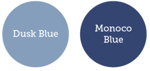
Dusk Blue (16-4120): a subtle pastel blue with gray undertones.
Brand buzzwords: Calm, Soft, Heavenly, Constant, Faithful, Dependable, Happy, Restful, Tranquil
Monaco Blue (19-3964): classic blue.
Brand buzzwords: Credible, Basic, Classic, Conservative, Strong, Dependable, Traditional, Nautical, Professional, Confident
PURPLES
A blend of the excitement and sexuality of red and the tranquility of blue, purples can have many meanings. Purple can be both sensual and spiritual, and can be associated with creatives and the spirituality of New Age philosophies. Deeper purple hues are royal and majestic colors, or they can evoke the flavor of grapes. A gray undertone tends to feel more sophisticated and subtle. The lighter purple tints, like lavender, wrap the senses with sweet scents and sweet tastes
Pantone Spring Purples
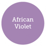
African Violet (16-3520): yummy lavender.
Brand buzzwords: Nostalgic, Delicate, Fragrant, Floral, Sweet
NEUTRALS
Neutrals signify time and antiquity, and durability. They represent the sands of time: solid, enduring, timeless, and classic. Neutrals are safe, non-offensive, and they never go out of style.
Pantone Spring Neutrals
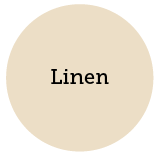
Linen (12-1008): nude.
Brand buzzwords: Classic, Neutral, Practical, Timeless, Quality, Basic, Wholesome, Natural
Are you looking to create a new brand, or refresh your existing brand with a burst of these new spring colors? Choose your brand colors carefully. What words, thoughts, and feelings are you trying to evoke in your target audience through color? Leave a comment below!


