Jurassic Park, Congo, The Andromeda Strain – who doesn’t love a good Michael Crichton novel? Even if you’ve never read any of his books, I’m sure you’ve enjoyed at least one movie or television show they inspired. “In 1994, Crichton became the only creative artist ever to have works simultaneously charting at #1 in television, film, and book sales (with ER, Jurassic Park, and Disclosure, respectively)”—per Wikipedia. Even beyond his untimely passing in 2008, his work continues to impress and inspire.
Last week at The Branding Spot, we talked about how the DVD industry has ‘judging a book by its cover’ down to a science. Using particular typography, colors and graphics, each genre has a similar look and feel, in order to attract a particular market of movie watchers. While we’re on the topic, I felt it’s time to quite literally judge some books by their covers!
The Crichton Brand
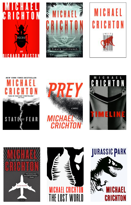
Over the years, I’ve noticed that Michael Crichton’s novel covers have evolved over time, eventually resulting in a solid, easily recognizable brand that cohesively connects his individual works.
Let’s take a look:
Typography: Michael Crichton’s name is featured in the same font on every cover (exception: Prey). The author’s first name is always stacked on top of his last name, taking up two lines on every cover (exception: The Lost World). Notice that his four most recent publications (Micro, Pirate Latitudes, Next and State of Fear) use the exact same typography conventions: his name takes up two lines, is centered, and is always at the top of the book, above the title.
Colors: The only colors used are black, white, red and gradients of gray (exception: Jurassic Park – title is in blue).
Graphics: Simple, but memorable—definitely distinguishable from the works of his colleagues.
Crichton’s brand clearly attracts a particular audience, even one perhaps not 100% familiar with his dark, ‘future history,’ often technology-based storytelling. In this way, Crichton’s brand serves two purposes:
- These choices in typography, colors and graphics unite his individual works into one brand that is cohesively and clearly Crichton—making it easy for fans to find his work on the shelf.
- The use of striking, yet simple graphics and dark colors with red accents attracts story seekers looking for this particular genre of story.
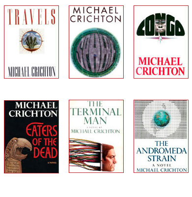
Now take a look at some covers from older Crichton novels:
 See the difference? All different fonts. All different colors. All different layouts. All different graphics. There’s a clear lack of a cohesive brand, unlike his later, well-branded works, which are simple, clean, clear, recognizable, and memorable. Interestingly, the adaptation of this branding was clearly a process implemented over time.
Be Cohesive Like Crichton
Your company and your brand are being judged by their “cover” at all times, by both your current clientele and your potential clientele. Your brand should be memorable and your brand should tell your unique story—and to accomplish both of those objectives, your brand must be cohesive so that it is easily recognizable to your ideal target audience.
When I’m looking for a Crichton book, I know exactly what to look for. Your target audience should share this mindset in regards to your business! It all starts with the look and personality of your branding materials—and don’t worry—like Crichton, it’s ok if your brand evolves over time, until you find a look and feel that’s just right.
You want your target market to see your brand and think, This is the company I’ve been looking for! With cohesive branding, using the same typography, colors and graphics, your target won’t simply notice your brand, they’ll remember your brand—and that spells long-term success!
Want to know if your branding is cohesive? A Brand Alignment may just be what you need to get your brand the attention it deserves.

